

A financial advisor website can look polished and still fail to generate meaningful opportunities. For growth-focused RIAs, website design has to help the right prospects understand who the firm serves, why to trust it, and what to do next. It also shapes search visibility, AI visibility, local visibility, and conversion rates.
In this guide, we’ll cover 12 best practices for building an RIA website around visibility, trust, usability, and qualified pipeline. A polished website and a website that contributes to growth are not the same thing. Strong web design and conversion experience treat every page as part of that difference.
Key Takeaways
- A website has to earn visibility before it can convert it: Strong financial advisor websites first attract more qualified prospects, then turn that traffic into consultations.
- Trust has to be built into the structure: Advisor bios, location pages, and trust signals belong where prospects are actually deciding, not buried on an About page.
- Mobile performance sets the baseline: Most advisor research starts on a phone now, so speed and usability there determine whether a prospect keeps reading.
- AI discovery depends on the same fundamentals: Clear structure, direct answers, and strong internal linking help both search engines and AI systems understand and cite a firm’s expertise.
- Measurement should track qualified opportunities, not traffic alone: A good-looking website only matters if it attracts, qualifies, and converts the right prospects.
What makes a good financial advisor website?
A good financial advisor website clearly communicates who the firm serves, establishes credibility, makes information easy to find, and gives qualified prospects a clear path toward contacting the firm.
That comes down to four jobs the website needs to perform.
| Website function | What it should accomplish |
| Visibility | Help the firm appear when prospective clients research advisors and financial topics |
| Relevance | Show the visitor that the firm’s expertise matches their needs |
| Trust | Provide enough evidence for prospects to feel confident evaluating the firm |
| Conversion | Give qualified prospects a clear, low-friction next step |
The 12 practices below build toward those four outcomes.
1. Lead with a clear value proposition
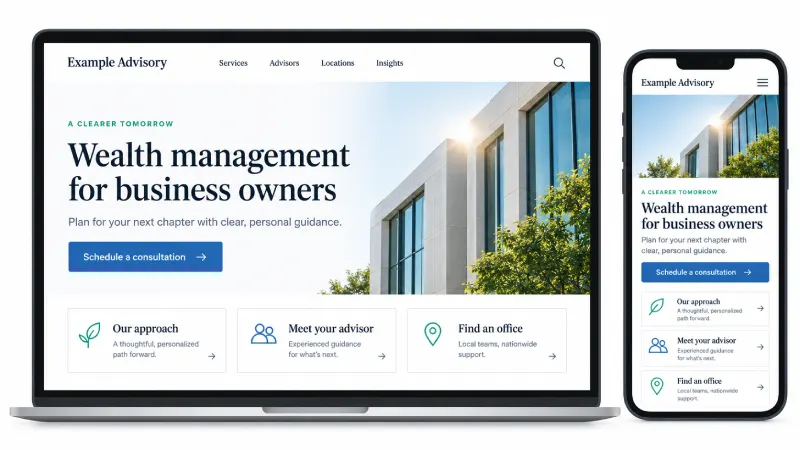
The hero, the first thing people see when they land on your website, should answer three questions almost immediately: who do you serve, what problems do you help solve, and why should the prospect keep exploring?
Generic advisor messaging like “Your Partner for a Confident Financial Future” tells a visitor nothing about fit. A stronger version, such as “Wealth Management for Business Owners Preparing for Retirement,” tells the visitor whether they are actually in the right place.
A strong value proposition includes:
- Audience or niche specificity
- Geographic relevance where it applies
- Clear differentiation from other firms
- Outcome-oriented messaging instead of feature lists
- One primary call to action
2. Design navigation around the prospect journey
Financial advisor website navigation should help prospects quickly find information about services, advisors, locations, the firm, educational resources, and how to get started.
A concise primary navigation works better than exposing every page in the site hierarchy.
A workable structure looks like this:
- Who We Serve
- Services
- Advisors
- Locations
- Insights
- About
- Contact / Schedule a Consultation
Internal terminology should never dictate navigation. Organize it around what prospective clients are actually trying to learn, not how the firm is organized internally.
3. Make advisor bios useful trust-building pages
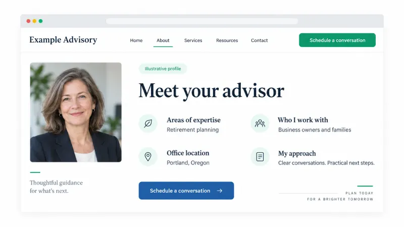
An advisor bio should give prospects real reasons to feel confident before they ever pick up the phone, rather than just a photo and a title. Advisor pages frequently become part of a prospect’s validation process, especially after a referral, local search, or first interaction with the firm.
A strong advisor bio includes:
- A professional headshot
- Role and areas of expertise
- Credentials and designations
- Relevant experience
- Client specialties
- Personal details where appropriate
- Office or location affiliation
- A clear next step
- Structured data and internal links where appropriate
A bio should help someone decide whether they want to speak with that advisor. It shouldn’t read like an internal résumé.
4. Build dedicated pages for each office location
Every physical office needs a genuinely useful local landing page, not a near-duplicate page with the city name swapped in.
Strong location pages include:
- Consistent name, address, and phone information
- A localized title and H1
- Advisors serving that office
- Services or specialties relevant to the market
- Office details and directions
- Local credibility or reviews where appropriate
- A contact or scheduling call to action
- FAQs with real local relevance
This connects directly to local organic visibility, Google Business Profile relevance, and conversion. Firms managing more than one office get more from location pages when they follow a broader local visibility strategy instead of treating each page as a one-off task.
5. Use trust signals where prospects need reassurance
Trust signals do the most work when they sit next to the specific claim or decision a prospect is weighing, not gathered into one badge-filled footer.
Useful trust signals for RIA websites include:
- CFP, CFA, or other relevant designations
- Assets under management, where appropriate
- Years in business
- Awards and recognition
- Media appearances
- Client testimonials where permitted
- Professional affiliations
- Custodian relationships where appropriate
- Security and privacy information
- Regulatory disclosures
Put proof close to the claim or decision it supports. A credential far from the page where a prospect is deciding does less work than one placed next to the relevant service or advisor. Weak trust signals are a common reason a credible firm fails to generate qualified leads.
6. Create clear conversion paths for different prospect intents
Not every visitor is ready to schedule a consultation, and treating every visitor the same way creates friction.
| Prospect intent | Potential next step |
| Early research | Read a relevant guide or insight |
| Evaluating expertise | Explore services or advisor profiles |
| Comparing firms | Review process, specialties, or firm information |
| High intent | Schedule a consultation |
| Needs more information | Contact the firm |
Forcing every visitor toward the same call to action can push away prospects who aren’t ready yet. Tying conversion design back to qualified pipeline, rather than raw form volume, keeps the site focused on the right outcome.
Not sure where your website is losing qualified prospects?
A Performance Diagnostic shows exactly where visibility, trust, and conversion are breaking down, and what to fix first.
7. Design service pages around client needs
Service pages that simply define “financial planning” or “wealth management” don’t do much work for the visitor.
Effective pages should explain:
- Who the service is for
- The problems it addresses
- What the relationship or process looks like
- Relevant expertise
- Related advisors or locations
- Common questions
- The next step
This structure also creates stronger pages for organic search and AI retrieval, since it gives both readers and systems a clear answer to work from.
8. Make your website mobile-first
A mobile-first financial advisor website should make it easy for prospects to research the firm, evaluate its advisors, and take the next step from any device.
It requires checking:
- Font readability
- Button and tap target size
- Navigation
- Form usability
- CTA visibility
- Image scaling
- Page speed
- Sticky elements
- Pop-ups or interstitials
Someone referred to an advisor may pull up the firm on their phone immediately after hearing the name. If that experience is slow or hard to navigate, the referral loses some of its value before the prospect reads a single word.
9. Improve website speed and technical performance
A handful of technical choices determine most of a website’s speed, and those same choices affect usability and search performance together.
Common problems include:
- Oversized images
- Excessive animation
- Unnecessary scripts
- Heavy page builders or plugins
- Third-party tracking
- Poor hosting
- Layout shifts
The goal isn’t a perfect technical audit. It’s removing the friction, engagement loss, and conversion drag that slow, unstable pages create. For a closer look at why this matters, see how site speed affects SEO and AI visibility together.
10. Build accessibility into the design
Accessibility should be part of creating a website people can actually navigate and use, not an afterthought addressed after launch.
Cover:
- Color contrast
- Keyboard navigation
- Form labels
- Alt text
- Heading hierarchy
- Descriptive link text
- Captions or transcripts
- Focus states
Many of the same issues that limit accessibility also limit how well AI systems and screen readers can interpret a page, so fixing them supports more than one goal at once. A closer look at common accessibility mistakes can help identify where a site currently falls short.
11. Create content that supports search and AI discovery
A website’s information architecture should make a firm’s expertise easy for people, search engines, and AI systems to discover and interpret.
That includes:
- Educational articles
- Clear topical organization
- Internal linking
- Descriptive headings
- Direct answers to common questions
- Advisor expertise
- Service and location relationships
- Original research or expert insights
A website needs to support prospects who arrive through traditional search, AI-generated answers, local results, referrals, and branded research. Strong Answer Engine Optimization depends on the same content structure that makes a site easier for human visitors to use, not a separate technical layer on top of it.
12. Measure whether the website generates qualified opportunities
Traffic, bounce or engagement rate, rankings, and form submissions only tell part of the story.
Connect website performance to:
- Consultation requests
- Qualified lead rate
- Conversion rate
- Pages generating qualified inquiries
- Source or channel
- Cost per qualified opportunity
- Pipeline contribution
- Client acquisition
The best-looking website isn’t necessarily the highest-performing one. A website should be evaluated on whether it helps the firm attract, qualify, and convert the right prospects, not on design awards.
Common financial advisor website design mistakes
The most common financial advisor website design mistakes come down to a handful of repeatable patterns that quietly limit growth.
| Design mistake | Why it hurts growth |
| Generic messaging | Makes it harder for ideal prospects to recognize fit |
| Weak conversion paths | High-intent visitors don’t know what to do next |
| Thin location pages | Limits local relevance and usefulness |
| Résumé-style advisor bios | Misses an important trust-building opportunity |
| Design-heavy pages | Can create usability and performance problems |
| Measuring form volume alone | Hides whether the website produces qualified opportunities |
How often should an RIA redesign its website?
An RIA should consider redesigning its website when the current site no longer supports the firm’s brand, growth strategy, user needs, technology requirements, or ability to convert qualified prospects. There’s no fixed timeline that applies to every firm.
Signs a redesign or major refresh may be warranted include:
- Firm positioning has changed
- New locations or acquisitions aren’t represented well
- Navigation has become unwieldy
- Mobile experience is poor
- Pages are slow
- Conversion paths are weak
- Content is difficult to maintain
- The website doesn’t support current SEO or AEO strategy
- Tracking can’t reliably connect website activity to pipeline
How website design fits into an RIA growth strategy
A growth-focused website sits between visibility and pipeline:
- Search, AI, local, and referral channels drive prospects to the website
- The website builds trust and qualification
- Conversion turns that into qualified pipeline
The website shouldn’t operate independently from SEO, paid growth, local visibility, content, analytics, or attribution. Those channels generate and influence demand. The website determines what happens when that demand arrives. This is exactly why web design lives inside the Revenue Performance System rather than functioning as a standalone service line.
Build an RIA website around growth, not design trends
Strong financial advisor website design makes it easier for the right prospects to find the firm, recognize that it fits their needs, establish trust, evaluate its expertise, and take the appropriate next step.
Getting there means treating web design as part of a connected growth system rather than an isolated project. A Performance Diagnostic can show where visibility, conversion, and measurement are currently limiting your website’s performance, and what to prioritize first.
Ready to build a website that drives qualified pipeline?
Schedule a strategy session to see how design, visibility, and conversion can work together inside the Revenue Performance System.